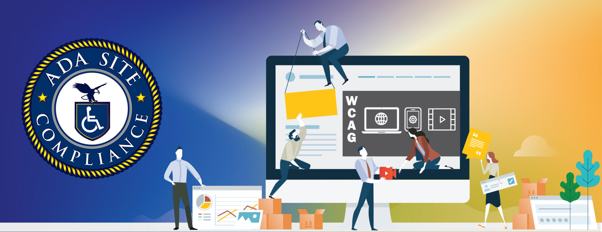
Accessibility Checker Testing Tools
Our Compliance Contrast Checker is a testing tool that performs an accessibility evaluation for font size and color contrast. Regular content accessibility testing is important so you can address accessibility issues immediately. When you design and maintain your website with accessibility and compliance in mind, you create a more pleasant environment for everyone.
Website accessibility starts within the basic design elements of color and font. People who are color-blind and vision impairments can experience sensitivity and often physical pain to certain colors and shades of light. A common assumption is that if a website designer uses color contrast to convey information, color-blind users won’t experience accessibility issues. Color hue and color contrast are two different dimensions. Color-blind users have trouble distinguishing specific color hues. (Color-blind users don’t have difficulty perceiving differences in color contrasts).
The Compliance Contrast Checker conducts an accessibility evaluation using the global standards determined by the Web Content Accessibility Guidelines, known as WCAG. The Web Content Accessibility Guidelines are recognized as the global standard for website accessibility. You can scroll down for the textbook jargon for website content accessibility or save the leg work by using our color testing and text evaluation tool.
We encourage you to use our accessibility evaluation tool when building web pages or creating when creating website content.
The below sections are prescribed for audience situations.
- Section 1.4.3 Contrast (Minimum): Level AA
- For body text, subtext, or general copy, the goal is a contrast ratio of approximately 4.5:1.
- For headers or larger text (Font size 18pt or 14pt bold), the goal is a contrast ratio of approximately 3:1.
- Section 1.4.6 Contrast (Enhanced): Level AAA
- Recommended for an expected audience that has aged or low vision.
- For body text, the contrast ratio can be enhanced from 4.5:1 to 7:1
Have a question?
We’re always here to help.
The ADA prohibits any private businesses that provide goods or services to the public, referred to as “public accommodations,” from discriminating against those with disabilities. Federal courts have ruled that the ADA includes websites in the definition of public accommodation. As such, websites must offer auxiliary aids and services to low-vision, hearing-impaired, and physically disabled persons, in the same way a business facility must offer wheelchair ramps, braille signage, and sign language interpreters, among other forms of assistance.
All websites must be properly coded for use by electronic screen readers that read aloud to sight-impaired users the visual elements of a webpage. Additionally, all live and pre-recorded audio content must have synchronous captioning for hearing-impaired users.
Websites must accommodate hundreds of keyboard combinations, such as Ctrl + P to print, that people with disabilities depend on to navigate the Internet.
Litigation continues to increase substantially. All business and governmental entities are potential targets for lawsuits and demand letters. Recent actions by the Department of Justice targeting businesses with inaccessible websites will likely create a dramatic increase of litigation risk.
Big box retailer Target Corp. was ordered to pay $6 million – plus $3.7 million more in legal costs – to settle a landmark class action suit brought by the National Federation of the Blind. Other recent defendants in these cases have included McDonald’s, Carnival Cruise Lines, Netflix, Harvard University, Foot Locker, and the National Basketball Association (NBA). Along with these large companies, thousands of small businesses have been subject to ADA website litigation.
Defendants in ADA lawsuits typically pay plaintiff's legal fees, their own legal fees for defending the litigation, and potential additional costs. In all, the average cost can range from tens of thousands of dollars, to above six figures. There are also high intangible costs, such as added stress, time and human capital, as well as reputational damage. Furthermore, if the remediation is incomplete, copycat suits and serial filers can follow, meaning double or triple the outlay. It's vital to implement a long-term strategy for ensuring your website is accessible and legally compliant.