
Website accessibility standards require that all websites are accessible to all users regardless of their color, race, location, or platform. As a website owner, you want specific colors for your brand. There are also those colors that do best for the call to action, headlines, etc. Unfortunately, particular colors aren’t visible to some people who are color blind. If you use these colors, you will exclude these visitors with visual impairment.
Color Blindness Accessibility in Website Design
Color blindness accessibility refers to designing your website such that people with color vision deficiency can read the content without any difficulty distinguishing the colors. Web content accessibility guidelines (WCAG) have put measures upon which color accessibility is measured.
Web accessibility guidelines apply to color contrast ratio to text, changes when a user hovers over the content on a web page, and color combinations on form placeholders. Logos and other graphics should also conform to the color web accessibility guidelines.
Types of Color Blindness to Consider During Web Designing
Sight disabilities are varied from person to person. Color blindness in one person could mean the inability to see bright colors, while it’s the inability to distinguish them in another person. A color-blind person could also be far or nearsighted. Therefore, it’s essential to understand different color spectrum disabilities to help you adapt your site for all users.
For starters, we have two types of photoreceptors found in the retina of our eyes. The photoreceptors are known as cones and rods. Rods are sensitive to light and will allow your eyeballs to adjust depending on the amount of light you perceive. Rods are why you can still decode some shapes even in a dark room.
Cones work best in light and are the ones behind the color distinction. Their absence or presence determines the severity of color blindness. The human eye has three types of cones responsible for different functions. The S-cones help you see the color blue, the M-cones decode green, and the L-cones reveal red.
Color blindness can be either acquired or inherited. The S, M, and L cones are mainly acquired. Whether inherited or acquired, color blindness occurs due to inefficiencies in the photoreceptors.

Types of Inherited Color Blindness
A defect in the genes that pass down cone function from the parent to the child causes inherited color blindness. This is why you will find one family where almost everyone has color blindness.
Tetrachromacy
Tetrachromacy is present in about 12 percent of the women in the world, which gives them a full-color spectrum. This population has a fourth cone that enables them to view more colors than anyone else.
Monochromacy
Also known as achromatopsia, this color blindness affects only one out of 33,000 people. Individuals in this category don’t see any bright colors, and everything reveals to them is black and white.
Anomalous trichromacy
Most color inabilities fall under this category because most individuals have defects with red, green, or yellow photoreceptors. Here is a breakdown of each category:
Red-green color blindness
The red-green color blindness is divided into four other sub-categories.
- Protanopia / red blind
People in this category have no red cones and thus don’t view red colors. - Protanomaly
Under this category, you can view red but in weak shades hence the name red- weak. - Deuteranopia
These individuals have no green cones and thus are green-blind. - Deuteranomaly
Here you can see some green colors but weak shades because green photoreceptors are available, albeit weak.
- Protanopia / red blind
Blue-yellow color blindness
These types of vision disability are rare, but it presents in two different forms if present.
Tritanopia / blue blind
Individuals don’t have blue photoreceptors.
Tritanomaly / blue- weak
The blue cones are present but weak; thus, people who suffer from this condition can see shades of blue.

What Causes Acquired Color Blindness?
As noted above, color blindness can either be inherited or acquired. Here are some of the causes of acquired color problems.
Alcohol consumption
Most alcohol addicts have problems distinguishing blue-yellow colors.
Certain chemicals
Lead, and carbon disulfide can cause color blindness even at low levels.
Brain injury
Trauma in the brain can cause low vision problems, especially color. It’s not always that you will also have color problems if you suffer a brain injury.
Terminal illnesses
People suffering from chronic illnesses such as Parkinson’s disease, Alzheimer’s, certain cancers, or stroke can experience color blindness to a certain extent.
Age
Blue-yellow color blindness may present in individuals as they age because the photoreceptors become weak, reducing the amount of light the cones can receive.
Website Elements that are Inaccessible to Color-Blind Users
A specific element could render your website useless to visually impaired users who may need more than one cue to perceive content. Here are some of the elements you need to update.
Text labels
You want to ensure that you add alt text to all color filters. For example, if your website has different colors, color-blind users might not differentiate them, especially if you sell products. Accompanying the products with a color description would make it easy for visually disabled individuals. For example, if you sell a red shirt or blue pants, accompany the image with a color description.
Underline links
As a common practice, most website owners will denote the text links by highlighting them differently. Unfortunately, some users cannot distinguish the links from normal text due to vision impairment. For example, if you highlight links in blue, an individual with blue color blindness cannot see them. It’s recommended to highlight and underline the links so that they are accessible to all users.
Utilize patterns and textures
Patterns and textures are vital because they help color-blind users visualize content. When applying patterns and textures, avoid using low-contrast color combinations as users with low vision may have difficulty distinguishing. Adding descriptive text on the charts and graphs can also help people with visual problems to understand the content better.
Use colors and symbols for contact forms
Some websites use only color to convey error messages when filling out a contact form. Users with color blindness will not see the alert and might have difficulty getting any help. Ensure that your website uses sufficient contrast colors and that the forms also include symbols to make it inclusive for all users.
Contact forms should have clear labels indicating the optional fields and the must-fill details. Alternatively, you can do away with all optional data in contact forms. The use of an asterisk to mark the primary buttons can also help color-blind visitors to get help faster.
Avoid certain color combinations
Some colors are difficult to see, and some have low contrast making it difficult for color-blind users to perceive color differences. Here are some of the colors to avoid:
- Green – Blue
- Green – Yellow
- Green – Red
- Blue – Purple
- Blue – Grey
- Green – Brown
- Green – Grey
Text readability
Readability is determined by color, font color, font size, and text enhancers such as italics. A very tiny font can make it difficult for some users to read as it can strain their eyes. The small font in combination with poor color contrast can make it even more difficult for color-blind users to interact with your content.
Notably, you cannot have an entire page of content written in white and then have a white background. The text color on a white background should have a contrasting color such as black.
Advantages of Designing a Website that follows Color Blindness Accessibility Guidelines
As much as color accessibility aims to give users with visual impairments a better user experience, it also benefits your business. Here is why:
It’s ethical to include all users
As a business owner, you want to make sure that you are at the forefront of digital inclusivity. Despite their race, color, region, or physical ability, creating friendly websites for all users is a moral obligation. Sadly, a survey conducted in 2021 revealed that less than 20 percent of all websites hosted for public use follow color accessibility guidelines stipulated by WCAG.
It is a legal requirement
Depending on your geographical location, you could risk legal action if you don’t comply with the color accessibility guidelines. According to Title III of the Americans with Disabilities Act (ADA), you can be sued for denying users with a disability an equal opportunity to use a digital platform.
Getting your business sued can have a negative image in public and could affect your returns. People tend to avoid businesses that have legal suits. The legal action could also cost you to hire experienced attorneys, court fees, and compensation to the plaintiff.
Improves general user experience
Color blindness accessibility guidelines apply to users with low vision or color blindness. Even people with normal vision will have a better user experience. When your website is accessible to all users, it increases organic traffic, reduces bounce rates, and increases conversion rates. We all know that this is important for ranking on search engines.
What Colors Work Best for Color Blind People?
As a best practice, use contrasting colors on your web content so that users with color deficiencies can easily see it. It is also essential to include a content map so that users of different visions can use this element. On the map, ensure that you denote clickable links by underlining them instead of using color to differentiate them.
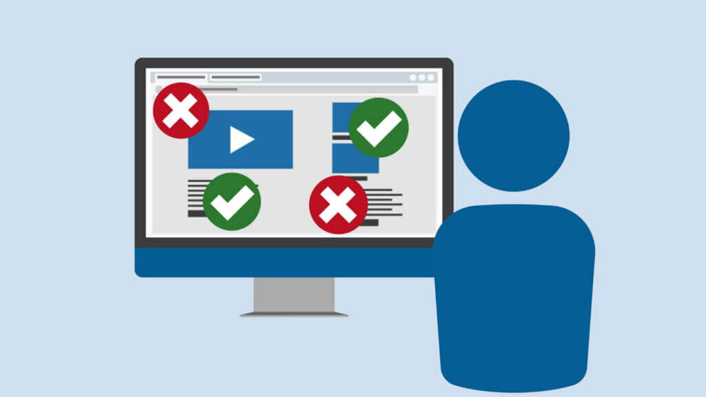
Using accessible colors is not enough to make your website accessible to people with disabilities, as stipulated by ADA. It would help if you went further to ensure that all elements in your website follow accessibility standards. You can test whether your site follows the set standards of accessibility manually or using automated tools.
Is it worth making your Website Accessible for Color Blindness?
Most business owners may wonder whether it is even necessary to follow the standards of accessibility for color blindness. Many website owners may even argue that the target group comprises a small population compared to people with normal vision.
The truth is that other than people with visual disabilities, older people also have visual difficulties. The older generation has shown a tremendous interest in digital content, making them a significant untapped market. The more accessible your site is to people with visual impairments, the more traffic you get and the more conversions you make.
Make sure your website is 100% accessible for the color blind by running a FREE SITE SCAN with us. We are here to help you fix all accessibility errors on your website!
Share via:

Speak With An Expert Now
Related Accessibility Articles

Digital Accessibility: A Guide to Global Inclusion
The internet, accessible across various devices and locations, has revolutionized our modes of interaction and work….

What Are Android Accessibility Features?
While any digital platform or operating system can present barriers to people with disabilities, Android devices…
What Are Website Accessibility Features?
Website owners design and build their sites so that they receive maximum visitors. And with millions…


Have a question?
We’re always here to help.
The ADA prohibits any private businesses that provide goods or services to the public, referred to as “public accommodations,” from discriminating against those with disabilities. Federal courts have ruled that the ADA includes websites in the definition of public accommodation. As such, websites must offer auxiliary aids and services to low-vision, hearing-impaired, and physically disabled persons, in the same way a business facility must offer wheelchair ramps, braille signage, and sign language interpreters, among other forms of assistance.
All websites must be properly coded for use by electronic screen readers that read aloud to sight-impaired users the visual elements of a webpage. Additionally, all live and pre-recorded audio content must have synchronous captioning for hearing-impaired users.
Websites must accommodate hundreds of keyboard combinations, such as Ctrl + P to print, that people with disabilities depend on to navigate the Internet.
Litigation continues to increase substantially. All business and governmental entities are potential targets for lawsuits and demand letters. Recent actions by the Department of Justice targeting businesses with inaccessible websites will likely create a dramatic increase of litigation risk.
Big box retailer Target Corp. was ordered to pay $6 million – plus $3.7 million more in legal costs – to settle a landmark class action suit brought by the National Federation of the Blind. Other recent defendants in these cases have included McDonald’s, Carnival Cruise Lines, Netflix, Harvard University, Foot Locker, and the National Basketball Association (NBA). Along with these large companies, thousands of small businesses have been subject to ADA website litigation.
Defendants in ADA lawsuits typically pay plaintiff's legal fees, their own legal fees for defending the litigation, and potential additional costs. In all, the average cost can range from tens of thousands of dollars, to above six figures. There are also high intangible costs, such as added stress, time and human capital, as well as reputational damage. Furthermore, if the remediation is incomplete, copycat suits and serial filers can follow, meaning double or triple the outlay. It's vital to implement a long-term strategy for ensuring your website is accessible and legally compliant.